举个栗子:
Note这是一个注意事项提示框。这种提示框通常用于展示一般性的提示信息。
> [!NOTE]> 这是一个注意事项提示框。这种提示框通常用于展示一般性的提示信息。一直很喜欢 Github 上的 Alerts,然后发现现在用的 hexo 主题并不支持…
于是就有了这篇文章。
Github Alerts 是对 markdown 的扩展,用
> [!NOTE]等快速构建告示框。
1. 安装 hexo-renderer-markdown-it
用 hexo-renderer-markdown-it 替换 hexo 原有的 markdown 渲染器。它的渲染速度更快,而且更有拓展性。
警告: 在输入命令之前,请确保你位于 hexo 主目录内。
1.1 卸载 hexo-render-marked
npm un hexo-renderer-marked --save1.2 安装 hexo-renderer-markdown-it
npm i hexo-renderer-markdown-it --save2. 加入自定义 js 脚本
这里通过扩展 markdown-it,实现检测 > [!NOTE] 等字段并给所在 blockquote 添加 class,实现自定义样式。
在 hexo 目录下 scripts 新建任意名称脚本,把下面 js 复制进去。
默认情况下 scripts 目录下 js 是会全局加载的。
hexo.extend.filter.register('markdown-it:renderer', function (md) {  md.core.ruler.after('block', 'github-alert', function (state) {    const tokens = state.tokens    for (let i = 0; i < tokens.length; i++) {      if (tokens[i].type === 'blockquote_open') {        // 找到 blockquote 的内容        let j = i + 1        // 只处理第一个段落        if (          tokens[j] &&          tokens[j].type === 'paragraph_open' &&          tokens[j + 1] &&          tokens[j + 1].type === 'inline'        ) {          let content = tokens[j + 1].content.trim()          // 兼容 [!NOTE]、[!NOTE]<br>、[!NOTE]\n          const match = content.match(            /^\[!(NOTE|WARNING|TIP|IMPORTANT|CAUTION|INFO|SUCCESS|ERROR)\][\s::-]*(.*)$/i,          )          if (match) {            const alertType = match[1].toLowerCase()            let restContent = match[2].trim()
            // 给 blockquote_open 加 class            let className = tokens[i].attrGet('class') || ''            className += (className ? ' ' : '') + `alert alert-${alertType}`            tokens[i].attrSet('class', className)
            if (restContent) {              // [!NOTE] 和内容在同一行              tokens[j + 1].content = restContent            } else {              // [!NOTE] 单独一行,移除该段              tokens.splice(j, 3)            }          }        }      }    }  })})
3. 刷新缓存
更改脚本后需要刷新缓存,目录下执行 clean 命令:
hexo clean4. 增加自定义 CSS 样式
刷新缓存重新运行后,就可以看到 > [!NOTE] <blockquote> 添加了”alert alert-note” class。
这里使用了 Font Awesome 中的图标展示,如没有该字体可自行更换 或 删除图标字符。
同时部分 css 样式并不通用,可进行更改。
将下方 css 样式在主题中引入:
.alert  padding: 1em  margin: 1em 0  border-radius: 4px  position: relative  display: block
  // 确保 alert 样式不会被 blockquote 样式覆盖  &.content blockquote, .content &    border-left: 4px solid #0078d4    padding: 1em 1.5em 1em 1em    margin: 1em 0    border-radius: 4px
  // 添加标题前的图标和文本  &::before    font-weight: bold    margin-bottom: 0.5em    display: block    font-family: "Font Awesome 5 Free", sans-serif
// 黑夜模式下的基本样式body.night .alert,body.night .content .alert,body.night .alert.content blockquote,body.night .content .alert blockquote  background-color: #373d48 !important  border-color: #434a56 !important
.alert-note  border-color: #0078d4 !important  background: #f3f6fb !important  &::before    content: "\f05a  NOTE"  // 信息图标 (i)    color: #0078d4
.alert-warning  border-color: #e0a800 !important  background: #fffbe6 !important  &::before    content: "\f071  WARNING"  // 警告图标 (!)    color: #e0a800
.alert-tip  border-color: #28a745 !important  background: #e6ffed !important  &::before    content: "\f0eb  TIP"  // 灯泡图标    color: #28a745
.alert-important  border-color: #d63384 !important  background: #f3f6fb !important  &::before    content: "\f06a  IMPORTANT"  // 感叹号图标    color: #d63384
.alert-caution  border-color: #fd7e14 !important  background: #fff5e6 !important  &::before    content: "\f06d  CAUTION"  // 火焰图标    color: #fd7e14
.alert-info  border-color: #17a2b8 !important  background: #e6f7ff !important  &::before    content: "\f129  INFO"  // 信息图标 (i)    color: #17a2b8
.alert-success  border-color: #28a745 !important  background: #e6ffed !important  &::before    content: "\f00c  SUCCESS"  // 勾选图标 (√)    color: #28a745
.alert-error  border-color: #dc3545 !important  background: #ffe6e6 !important  &::before    content: "\f00d  ERROR"  // 错误图标 (×)    color: #dc3545
所有样式
避免后面样式更新,这里放张展示图片 =w=
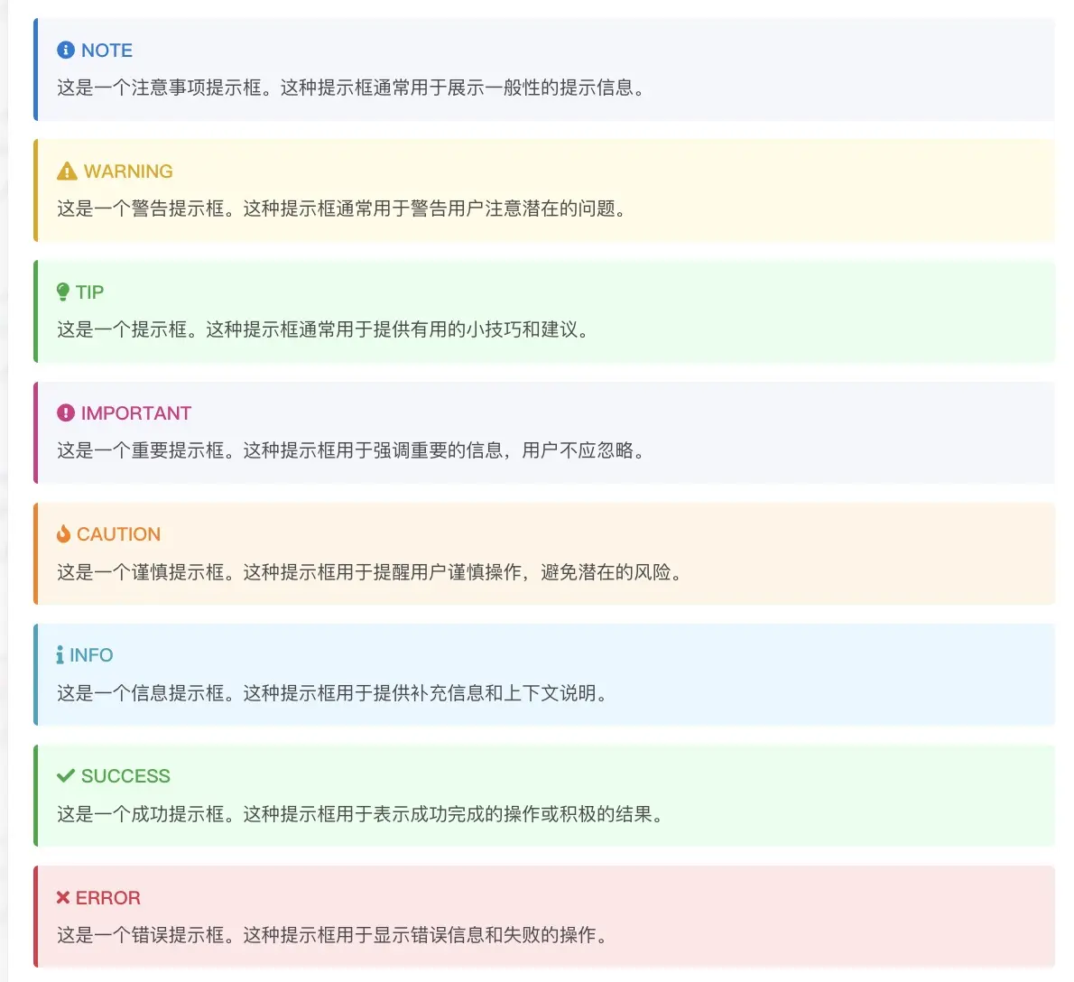
> [!NOTE]> 这是一个注意事项提示框。这种提示框通常用于展示一般性的提示信息。
> [!WARNING]> 这是一个警告提示框。这种提示框通常用于警告用户注意潜在的问题。
> [!TIP]> 这是一个提示框。这种提示框通常用于提供有用的小技巧和建议。
> [!IMPORTANT]> 这是一个重要提示框。这种提示框用于强调重要的信息,用户不应忽略。
> [!CAUTION]> 这是一个谨慎提示框。这种提示框用于提醒用户谨慎操作,避免潜在的风险。
> [!INFO]> 这是一个信息提示框。这种提示框用于提供补充信息和上下文说明。
> [!SUCCESS]> 这是一个成功提示框。这种提示框用于表示成功完成的操作或积极的结果。
> [!ERROR]> 这是一个错误提示框。这种提示框用于显示错误信息和失败的操作。
大家在聊 (0)
加载评论中...
还没有人留言
快来抢占沙发